Google has unveiled a bold new icon design inspired by disco balls, sparking user debate about the future of its visual identity. The company is testing these glittery, multicolored icons with a humorous twist, asking users if they're sure they want this change. This article explores the news, user reactions, and the potential impact on user experience.
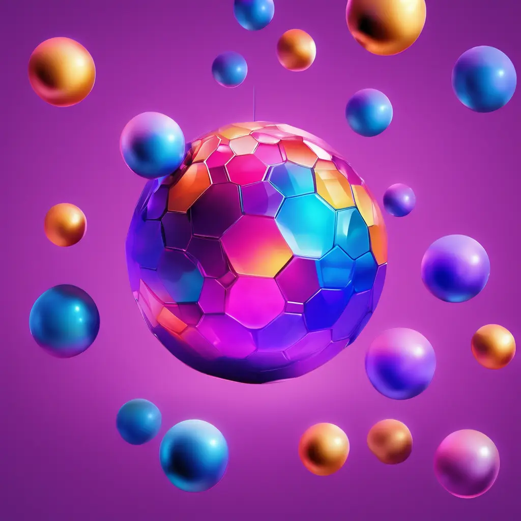
In the ever-evolving world of technology, Google never ceases to surprise its users with continuous updates. However, its latest move might be the most controversial yet. The company has unveiled new icons with a design inspired by shimmering disco balls, accompanied by a sarcastic comment: 'Are y'all sure you still want this?' This bold change in the user interface raises questions about Google's design direction and how well the public will embrace such unconventional innovations.
According to a report by TechCrunch, Google has begun testing new icons that reflect a completely different visual style from the flat, minimalist design users are accustomed to. The new icons feature shiny, multicolored accents, mimicking the effect of the iconic disco balls from the 1970s. The announcement came via the company's social media platform, where the design team asked, 'Are y'all sure you still want this?', indicating that the company is gauging user feedback before making a final decision.
This step is part of Google's ongoing effort to refresh its visual identity, following its previous adoption of Material Design, which focuses on simplicity and functionality. However, the new icons represent a sharp turn toward bold visual expression, which may reflect the company's desire to attract younger demographics or inject a playful tone into its services.
This change is expected to elicit mixed reactions from users. While some may welcome the innovation and boldness in design, others may feel nostalgic for the simple, easily recognizable layout. From a marketing perspective, this could be an attempt by Google to differentiate its services from competitors like Apple and Microsoft, which adhere to more traditional designs. Additionally, using humor in the announcement may help mitigate potential criticism and foster an interactive dialogue with users.
On the other hand, Google must consider that radical changes to the user interface could confuse some users, especially those who rely on quick icon recognition for daily tasks. Therefore, the company is likely to adopt a gradual approach to implementing these changes, possibly offering an option to revert to the old design during a transition period.
The new icons are inspired by shimmering disco balls, featuring bright colors and glossy visual effects, marking a departure from the flat design Google currently uses.
Google aims to measure user reactions to the bold design, which may be part of a broader strategy to update the company's visual identity and attract new user segments.
So far, Google has not confirmed the scope of the rollout, but testing is likely to begin on specific services like Gmail or Google Drive before expanding.
There is no specific timeline, but Google may launch the update later this year if it receives positive feedback.
Google typically offers customization options for users, but no detailed information has been announced regarding the ability to retain the old design.
Google's new disco ball icons represent a bold step in digital design, reflecting the company's desire for innovation and renewal. As users await more details, the key question remains: Will the public embrace this radical change? The coming days will reveal how successful this strategy is in balancing visual appeal with ease of use.
Source: TechCrunch AI | Analysis & Editorial: AI Tools Oasis
Bringing you the latest news and analysis in the world of Artificial Intelligence with accuracy and credibility. Follow us for all updates.

OpenAI is advancing its ambitious super app project, aiming to integrate advanced AI capabilities into a single, multifunctional platform. This development is part of the company's strategy to expand services and deliver a unified user experience. Discover the full details and expected impact of this move.
Notion has restored access to its Anthropic AI integration after a 4-hour outage disrupted users relying on Claude-powered features. The incident highlights the growing dependency on AI productivity tools and raises questions about infrastructure stability. All user data remained secure during the disruption.
A new report from TechCrunch AI warns of a potential 'Tokenpocalypse'—a massive collapse of digital tokens due to oversupply. With over 80% of new tokens losing 90% of their value, the market faces a crisis reminiscent of the dot-com bubble. This analysis explores the risks, impacts, and how investors can protect themselves.